
I don't think much about cool typefaces these days, I'm generally just looking for something readable and pleasant for UIs and websites. But I still get a kick out of my favorite subject from school. This is really beautiful.

Stuff and things
I don't think much about cool typefaces these days, I'm generally just looking for something readable and pleasant for UIs and websites. But I still get a kick out of my favorite subject from school. This is really beautiful.
Been thinking about doing this ever since I did the last one. It never quite came out the way I wanted and frankly, the newspaper-ish feel just didn't work. It worked in my head, and it sorta-kinda worked in Figma, and it just didn't translate.
After reading about Utopia and thinking, hey maybe I should do that, I went a little deeper into the rabbit hole of simplicity.
Some notes:
rclone and editing live with GEdit (Atom couldn't browse and edit the remote files fast enough).I suppose I'll enjoy looking at this for a couple weeks and then off we go again, probably with a pendulum swing to complexity. Or maybe I'll just change that yellow to something else to tide me over for a bit.
Now this is something interesting.
Obviously we've gotten pretty far away from the fundamentals of the web. "Text with hyperlinks" is the mission of the Gemini project, something that's described as heavier than Gopher and lighter than the web. So there's an appetite for those simpler days. All the myriad ways we've strayed from Hypertext's light would take quite a few more blog posts and sound like an old man yelling at clouds, but in terms of web design it feels pretty specific. Build tools. Compiled code. Scoping and renaming classes at runtime. Arguments about whether to put CSS in JS. Not gonna belabor that, you get it.
I taught myself to ditch tables around 2002-2003 by reading Eric Meyer's O'Reilly title CSS: The Definitive Guide, which is purely a reference title. It was not what I would call complicated. It probably took me just as long to figure out how to implement Grunt, which was already supplanted by Gulp by that time. Life is complicated, and I guess life in CSS has gotten that way as well. It feels such a long way from the CSS Zen Garden.
I don't necessarily think that breakpoints and media queries are an extreme example of the complication — remember conditional comments? Remember writing separate sites from Netscape and Internet Explorer? But I do think Utopia's authors asserting that their framework is "declarative" instead of "prescriptive" or "instructive" brings it back to the fundamentals of CSS. I find it a bit ironic though that they're using some really complicated calculations to achieve simplicity for the user. I recognize that bootstrap does something similar when calculating the grid, but the deeper the math I don't understand burrows, the more scared I am of relying on it.
I haven't read enough of the material here to understand how they handle anything other than the spacing and typography — and whether they like it or not, there is more to it than that, even if those are the only two things you can't take away. Looks like it may be relying on CSS grids to keep things in one media space. And lord knows I haven't adequately learned CSS grids yet. But I'm going to give this a shot. Maybe the next version of this site will be Utopian.
Pentagram does a snarky thing with a fun type design. Like Bierut, I wonder if any of these terms the FBI notes have ever been used by anyone. The idea of the document reminds me of the old Law Enforcement Guide to Satanic Cults. Link is to the film but its print predecessor baffled me even in middle school.
It speaks to the (uh, problematic) law enforcement mindset that there are dark forces and coded evils working in all corners of the world and they're the last bastion of defense against it. Too often those "evil" symbols are just non-WASP identifiers, and fear of youth comes from the same place — especially when so much of internet slang comes from AAVE and other non-white sources.
Eric Meyer on the CSS Working Group's attempts to add conditionals to CSS. My most recent side project uses pure CSS with variables, which is a huge step toward me not caring about preprocessors anymore. With logic, the only things left are concatenation (probably solved already), and nesting syntax, which I find cleaner to go through later on. He's right though, as a Sass user I can easily see both sides of this argument and don't know what's right. But I know it's progress, and in my current way of thinking, more features in CSS is better. Because no matter how "bloated" you think it'll be, it's still better than having to use extra tools that aren't natively parsed by the web browser.
Framer Sites looks wild. Framer already generates pretty good HTML, and this seems to represent the final few pieces necessary to actually turn that into a functional website. And CMS features are coming soon? Finally someone's really coming for the king in a big way, for the first time since the king has been Figma.
Is this finally The Thing we've been looking for? A design tool that builds websites visually, but in a real "web-like" way? That's been an unsatisfactory process since my first job using NetObjects Fusion (which apparently is better in itself these days, using CSS grid instead of the absolute positioning it employed almost 25 years ago). Frankly, potentially exciting, although these days — as in those days — it's fun to whip up some HTML to create a nice looking site. Still feels like alchemy to me.
Few pieces of gear are, on their own, really inspiring. Even the worst gear has its merits, but even the best sounding stuff isn't enough to be a wellspring of creativity. Ableton Live comes to mind, as well as the truly unique Novation Circuit, a cheap groovebox with no screen that I love almost as much as a family pet.
Lately I've been digging an old school piece of hardware that probably sounds the least likely to fall into this category. The Alesis MMT-8 is technically not a sequencer, but an 8-channel MIDI "recorder" and playback machine. It really does work a lot like an 8-track tape machine, but with MIDI data instead of audio. That means that it can control up to 8 devices by either playing notes, triggering their own sequencers, sending program change, and transmitting CC data. It's become the central master of my setup, and though it has its faults, it's so refreshing to get away from the computer for real that I'm itching to get on with writing new music.
It's a strange design that could only come out of the late 80s, like Knight Rider. It shares the lazer-zap shape with its brother the HR-16 (precursor to the most successful drum machine of all time, as well as the strange flip-up panel on top that contains an abbreviated user manual. Oddly, that shape does have the advantage of fitting a Korg Volca really nicely.
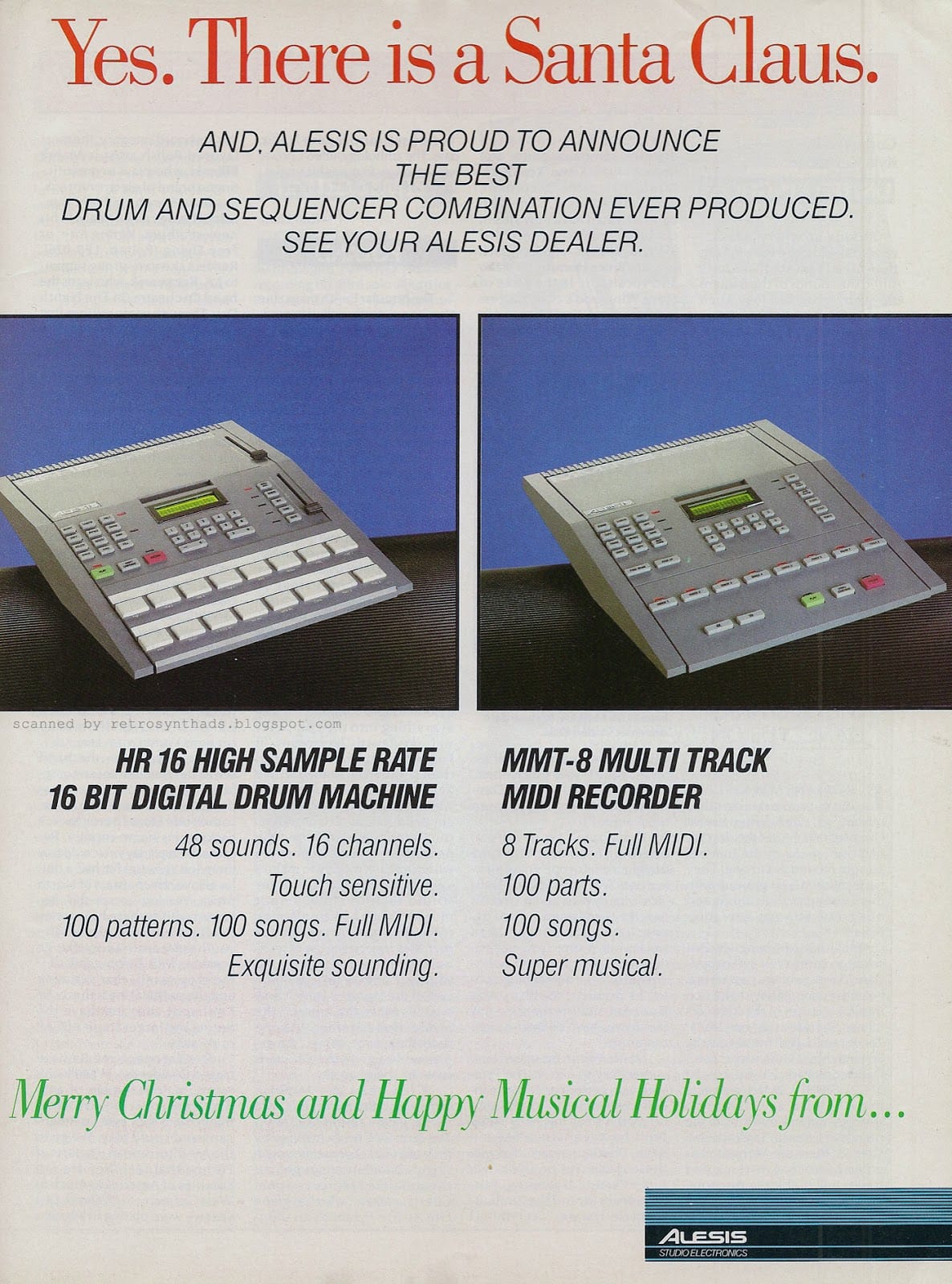
The first "issue" with the machine is that it doesn't have a very accurate clock. It's slow by about a whole BPM. If you want to be tempo-accurate, you need something else to send the data. On its own though, it has a pretty solid clock, though it purely transmits what was recorded into it, so if you want some unique feel or timing with "character" you'll need to trigger other sequencers. I'm just dreading when I play a show and someone comes up to me to say "I bet you thought you were playing at 74 bpm but that was really 73." They're out there. I'm sure of it.
The one workflow issue it has is a lack of overdubbing. If, for instance, I want drums and hi hats to be on the same track, I have to play the whole mess at once. Potentially a challenge, and more or less impossible if I want some kind of CC data at the same time. So those have to go on different channels. That being said, I have yet to feel like I need more than 8 channels. And when I do, I'll probably just find another MMT for about a hundred bucks. It does have extremely detailed editing capability as long as you're willing to do it on a 2-line LCD screen with squishy rubber buttons.
It's remarkably fast and intuitive once you're in there, and that has always been the most important thing to me in a creative tool. Get me punching in notes and feeling the song, not thinking about how a thing works. And it's rare to get that along with the immediacy of hardware.
So, Alesis MMT-8, I salute you.
Here's a rare intersection of my interests. This is actually a great article for UX folks who don't know anything about synthesizers.
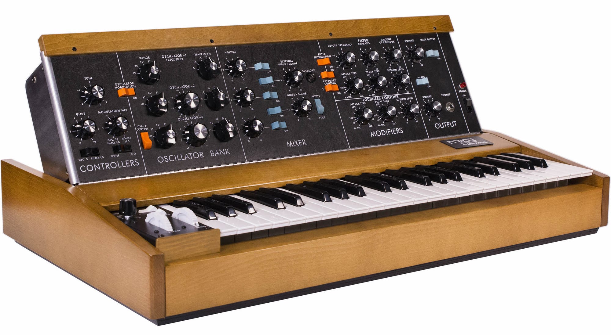
The author makes the (accurate) argument that Bob Moog changed the game by hard-wiring some signal paths and abandoning the fully customizable cable-based routing of modular synths.
This is essentially what Apple did in terms of UI as well that led to their early success:
That made Apple popular with artists, designers and musicians, just as the Model D became the first synth truly popular with a wide range of musicians. Sure, the Rick Wakemans (and Linus Torvalds) of the world might want more, but they have their complicated alternatives. For the rest of us, it was finally time to make music with synths. Just watch any gear-focused interview with John Foxx, Gary Numan, George Clinton, Rick Wright, you name it — the Model D hugely influenced their worlds so they could influence the rest of the world.
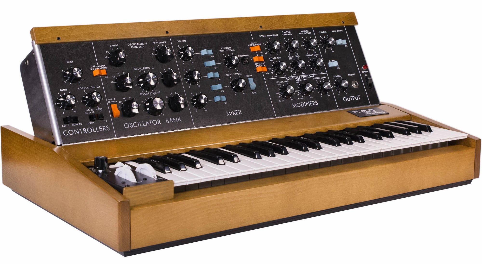
This philosophy can still be controversial at times, as with GNOME 3 (which, incidentally, has become less loathed in the years since its release), but in general the idea of solving for the 90% of users who don't need 50% of the features is considered an obvious one nowadays.
Of course, modulars have seen a resurgence lately because once you're in deep you inevitably want to start making your own synths. But that hasn't stopped the steady stream of simplistic analog boxes like the Volca series or Behringer's slavish old-school synth imitations. Options are great, but menu diving is no fun and the quickest way to get a musician to love your instrument is to get them creating quickly.
And this, as the article gets across pretty well, is what we should learn from Moog.
Apple would've patented the pitch wheel though.
I'm definitely not alone here but finding the perfect toolset is a slight neurosis of mine. And I thought I had it with Typora, a flat, local markdown editor with a notebook view and cross-platform access. But along comes a reference to Obsidian — in our local Nextdoor of all places — and I feel finally ready to move things off Notion and out of the cloud.
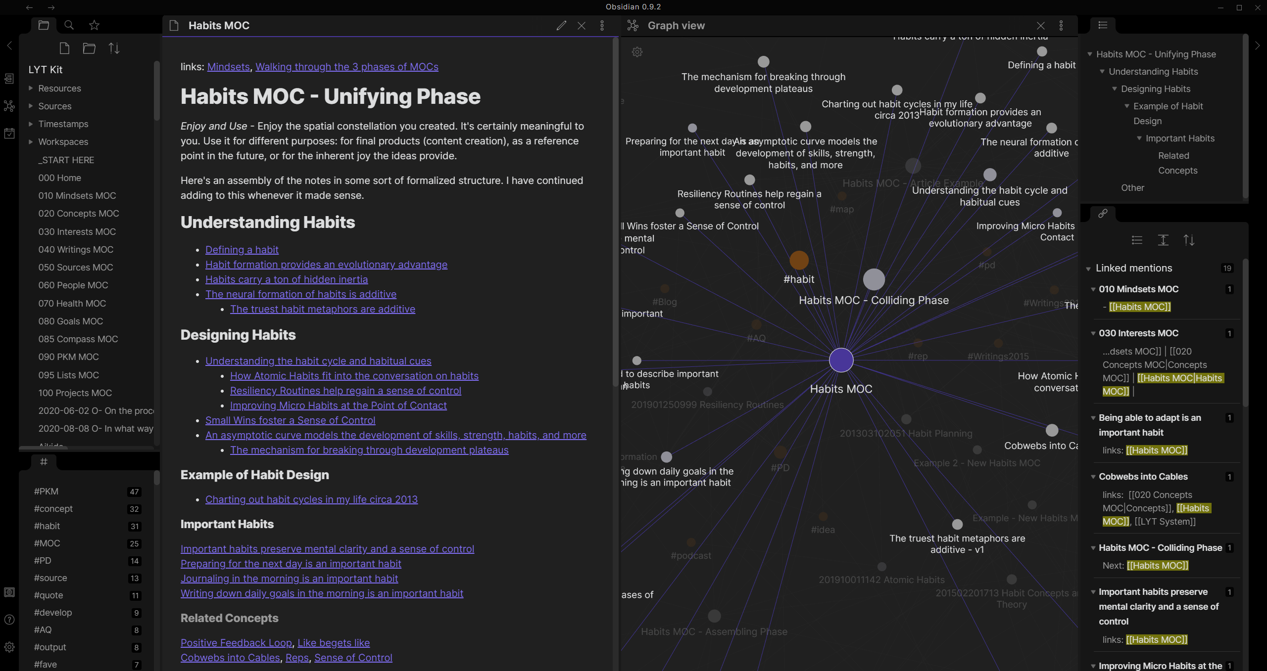
Obsidian has a lot of great features on top of being a markdown notebook, including:
The one thing it lacks from Notion is a database, but increasingly I find that the kitchen-sink approach isn't working for me. I just want structured text with images, and I can go to LibreOffice Base or Airtable to organize data.
EDIT TO THIS POST: Figma has a much more native way of handling this now. It's pretty rad, try it out.
If you're like a lot of designers, especially young enthusiastic ones or possibly freelancers with time between projects, you love to organize and beautify your systems. I've made a new CSS theme for my markdown editor! I built a home page for my browser that beautifully links to my current projects and most common pages. Etc.
One of the big offenders in the mess of my work life is the list of Figma projects. It'll always be preferable to the classic joke of design_final_final_r2__final.sketch that anyone still in pre-Figma world is probably still dealing with, but it can be rough on the eyes.
I came up with something that works well for me.
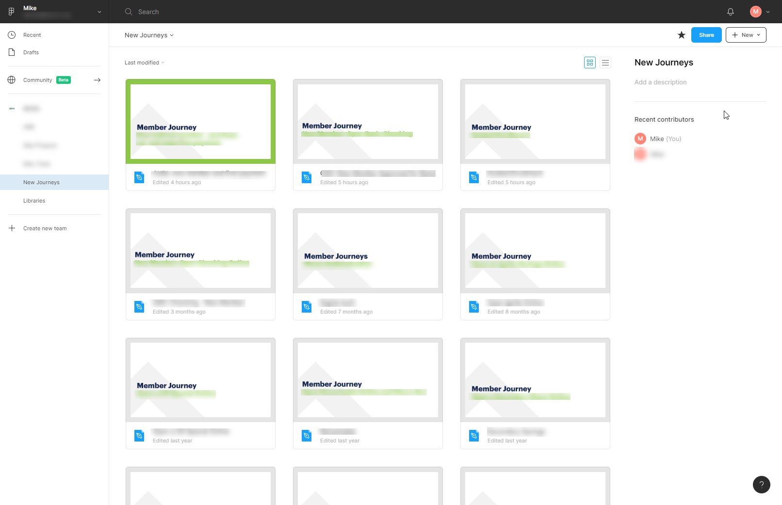
Create components for those covers in case you feel like you might want to change them down the road. Et voila, you've really simply gone from a mess in your projects list to an organized and legible design portal.