
All postsEXPLORE TOPIC

#design

Multi edit

I think it's probably safe to say that Figma eroded their own trust with the whole Adobe deal, which was preemptively killed by EU regulators. It definitely made Dylan Field look like just another startup founder looking for a payday by selling to a big company. Unfortunately for him, his company made something too indispensible to merge.

To their credit, they have since continued to move forward with new features, some of which are pretty useful and some of which are the now depressingly-standard "look, we added AI to a thing."

The newest one is way beyond "pretty useful." Multi edit is so rad. Legitimate game-changer that makes long-standing problems like "when do I stop designing intuitively and start turning these pieces into components?" just vanish. Check out the playground file if you can't get your head around why this is so valuable.
Discuss

Another day, another blog redesign

Been thinking about doing this ever since I did the last one. It never quite came out the way I wanted and frankly, the newspaper-ish feel just didn't work. It worked in my head, and it sorta-kinda worked in Figma, and it just didn't translate.

After reading about Utopia and thinking, hey maybe I should do that, I went a little deeper into the rabbit hole of simplicity.

Some notes:

  • There was no Figma phase to the "design."
  • I did this entirely live by mounting my website with rclone and editing live with GEdit (Atom couldn't browse and edit the remote files fast enough).
  • There are 157 lines of CSS, un-minified, with a carriage return between each rule. It uses zero media queries. There aren't even any columns, so I didn't get the chance to evolve from flexbox to grid.
  • I'm using CSS custom properties for the second time in my life, and though it doesn't give me everything I want from the Sass feature set, it's really great to get variables while staying native.
  • I didn't quite leave the HTML unchanged, but I probably could've. I've been using almost the same HTML pretty much since I switched to Kirby many years ago.
  • Standard posts have a larger first paragraph. This might possibly be inspired by Lagrange, the nicest Gemini client out there.

I suppose I'll enjoy looking at this for a couple weeks and then off we go again, probably with a pendulum swing to complexity. Or maybe I'll just change that yellow to something else to tide me over for a bit.

Discuss

The FBI Guide to Internet Slang

Pentagram does a snarky thing with a fun type design. Like Bierut, I wonder if any of these terms the FBI notes have ever been used by anyone. The idea of the document reminds me of the old Law Enforcement Guide to Satanic Cults. Link is to the film but its print predecessor baffled me even in middle school.

It speaks to the (uh, problematic) law enforcement mindset that there are dark forces and coded evils working in all corners of the world and they're the last bastion of defense against it. Too often those "evil" symbols are just non-WASP identifiers, and fear of youth comes from the same place — especially when so much of internet slang comes from AAVE and other non-white sources.

Discuss

Is this it?

Framer Sites looks wild. Framer already generates pretty good HTML, and this seems to represent the final few pieces necessary to actually turn that into a functional website. And CMS features are coming soon? Finally someone's really coming for the king in a big way, for the first time since the king has been Figma.

Is this finally The Thing we've been looking for? A design tool that builds websites visually, but in a real "web-like" way? That's been an unsatisfactory process since my first job using NetObjects Fusion (which apparently is better in itself these days, using CSS grid instead of the absolute positioning it employed almost 25 years ago). Frankly, potentially exciting, although these days — as in those days — it's fun to whip up some HTML to create a nice looking site. Still feels like alchemy to me.

Discuss

Figma organization for busy designers

EDIT TO THIS POST: Figma has a much more native way of handling this now. It's pretty rad, try it out.

If you're like a lot of designers, especially young enthusiastic ones or possibly freelancers with time between projects, you love to organize and beautify your systems. I've made a new CSS theme for my markdown editor! I built a home page for my browser that beautifully links to my current projects and most common pages. Etc.

One of the big offenders in the mess of my work life is the list of Figma projects. It'll always be preferable to the classic joke of design_final_final_r2__final.sketch that anyone still in pre-Figma world is probably still dealing with, but it can be rough on the eyes.

I came up with something that works well for me.

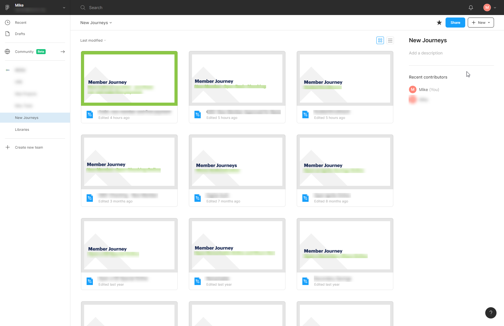
  1. Firstly, you have to give files a cover page. Just do it. Mine use a frame that is 1240px x 660px.
  2. Each Figma project is actually a project category: Online banking designs, public web page designs, internal software tools, customer journey maps, and libraries. Within those, each has its own style of cover page. This gives each listing page a unified feel and it's always obvious which list I'm looking at.
  3. I use the default gray background on the cover page, unless it's something I'm actively working on at the moment. Then I change it to green. This gives the cover a green border around it in the listing page.

Create components for those covers in case you feel like you might want to change them down the road. Et voila, you've really simply gone from a mess in your projects list to an organized and legible design portal.

Discuss

Hopefully the last word on Design Thinking

Khoi Vinh, a voice of reason, finally weighs in on the debate with "In Defense of Design Thinking, Which Is Terrible." Apparently he also thinks that most of the arguments against design thinking are anti-democratization.

So when I consider design thinking, it matters less to me whether it leads to a lot of bad design or not. What matters to me is whether it helps broaden the language of design, if it helps expand the community of design, if it helps build a world that values and understands design better than it does today. If design thinking is making us more relevant to the world at large, leading non-designers to embrace the way designers think, then the net effect strikes me as positive.
Discuss

Microsoft's persona spectrum

I think the headline is bait and the sentiment is a little radical — as someone who's been working with more behavioral-based personas for a long time, I'd say there's plenty of use personas still have as a design tool. It's just that people, especially marketers, have been using them poorly for years.

However, Microsoft's inclusive "persona spectrum" idea is great. It helps to demonstrate that accessibility and inclusion aren't just about (for instance) serving blind users, they're about serving everyone in as many cases as we can.

Discuss