
THE DAILY STREAM

Mike's site

Stuff and things

Latest updates
Newest first

My favorite albums of 2014

Now that it's almost February, I assume everyone has already read all the best-of-the-year lists that matter to them. So here's one that won't. These are the best records I heard that came out in 2014.

AURORA

Ben Frost - A U R O R A

I honestly really didn't know anything about Ben Frost and hadn't heard his earlier stuff, but this is a magical concoction of computerized and percussion-heavy experimental electronics that takes me back to the days of playing shows with fellow laptop jockeys and industrial car-part-smashers. It's a varied, rich, and constantly surprising piece of work, and it has Thor Harris on it too!

St. Vincent

I've seen St. Vincent, and I've heard pretty much all of her albums, but this was the first one to really catch my ear. This is the kind of art rock that people like Peter Gabriel and Kate Bush used to do — accessible but genuinely attempting to go places. She's also the kind of guitar player who's super talented but intriguing, not shreddy.

Soused

Scott Walker and SunnO))) - Soused

As Scott Walker gets increasingly prolific in his old age, it's starting to be apparent that he's actually got a pretty in-tune sense of humor. On paper, Walker with Sunn is the Lou Reed/Metallica album that actually works. In practice, it's basically a Scott Walker album with guitars, and that's just fine.

SWANS - To Be Kind

The Seer was maybe the peak of Gira's output, ever. It was the realization of the promise that Swans are Dead teased us with just before he originally disbanded the group. The only thing wrong with To Be Kind is that it's not The Seer.

Sumerian Fleet - Just Pressure

I basically kind of started following Dark Entries records around the time I got super into the Minimal Wave catalog as well. That led me to their flagship release of 2014. This retro slice of Linn-driven heavy old-school EBM meets sparse synth-wave makes me think of the best of early 242, and it's immaculately produced.

Run the Jewels 2

It topped a lot of the pros' lists, and it's probably obvious why. The first RTJ was a cool side project, but the real potential of an El-P/Killer Mike collaboration opened up on the second one.

BLXPLTN - Black Cop Down

This is one of Austin's most exciting local bands, but they're not going to get the press that the mellower or more rockist indie groups will. They're a hardcore band with a drum pad. What a weird thing, but they're so fierce, catchy, and fist-in-the-air angry it's hard to deny the live show or the record.

Under Color of Official Right

Protomartyr - Under Color of Official Right

The first Protomartyr album was kind of out of nowhere, and doing the jagged Fall-inspired post-punk thing in Detroit is unexpected. But the production is better, the songs are tighter and darker, and Joe Casey's incredible lyrics are more audible on the second one. It's a mix of a realistic portrait of alcoholic depression, a lament for Detroit, and what Casey calls "bad dad songs" (one of which, "Bad Advice," is about Kwame). This, from "I Stare At Floors," sums up well:

The day comes
same as before
it goes on again
the television a concave window
lawyers and murderers
the Law's confusing, the Order makes no sense
Scratching the skin
Staring at walls, staring at floors
The plan today is not to die
The cure-all's always over ice

I listened to it every day for like 3 months and still can't get enough.

Other stuff

Fennesz, Aphex Twin, The Bug, FKA Twigs, and of course Shellac all put out solid albums this year that I enjoyed a lot.

Honorable Mention from 2013

Speaking of Minimal Wave, I also discovered Veronica Vasik's sub-label Cititrax and the act Kontravoid. He apparently used to be the live drummer for Crystal Castles but in any case his self-titled dark synthpop LP from 2013 got a lot of play from me as well.

Discuss

Change is what the web is about

wrote this for our corporate blog. Rather than give everyone I know instructions for connecting to our VPN, I thought I'd reproduce it here. The gist is: as we go through a lot of change both process-wise and philosophically, we need to make sure nobody gets too attached to one way of thinking and gets left behind.

Since its inception, the Web has undergone constant evolution. But along the way, it’s also gone through some major revolutions that left it forever changed — and left some people behind.

Purty Pitchers

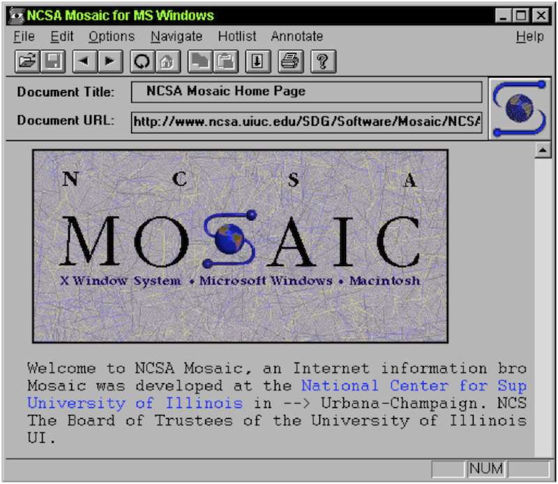
The first earth-shattering change was the NCSA Mosaic browser. Why? One word: graphics. Color graphics! You wouldn’t think this would bother anyone: sure, they took a long time to load and were really awful quality purplish GIFs for a long time, but being able to navigate around a web page with your mouse and scrollbar really opened up the web to a lot of people who would never have touched the green-on-black terminal browser Lynx.

NCSA Mosaic

Still, there were casualties: the early denizens of the internet, the super tech-savvy terminal jockeys and ASCII artists who preferred the music of a ker-chunking IBM Model M keyboard to the click of a mouse saw their little private utopia being taken away. In a way, I can sympathize. They were probably worried it’d be filled with n00bs, dads and ads eventually.

But the lesson is there. Adapt or get left behind.

The Blue Beanie

Most of these revolutions have happened during my career. The rise and fall of Flash, the advent of YouTube, blogging… it’s been a fun ride so far.

But from a designer/developer standpoint, something that in hindsight might’ve had the biggest effect was the Web Standards movement. As late as the mid–2000s, we’d been designing pages based on some anonymous genius’s realization that HTML tables and weirdly sliced images could be used to create print-like layouts on web pages. Thus the business of “web design.” But this was a hack, and it helped us grow an appetite for hacks. Meanwhile, Netscape and Microsoft were vying for supremacy in the browser market by adding more and more amazing but completely incompatible features. So we essentially had to build sites twice.

zeldman

But then Jeffrey Zeldman came along and told us all to try something: first off, stop using tables, because we’re hacking a useful feature of the browser to do something awful it wasn’t meant to do, and second, stop using these browsers’ non-standard features. Start using CSS. Thus the Web Standards Project (and what has come to be called the web standards movement) was born. And this movement effectively ended those dreaded Browser Wars.

Trust me, we’re all better for it. But for a while, there were a lot of designers and developers who didn’t want to abandon their fancy browser features, and didn’t want to stop using tables because they worked! Those people adapted. Or they became irrelevant once the browser makers got on board with the Standards crowd.

Responding to Change

The arrival of web applications was not about just one thing. Faster broadband, AJAX, browsers able to run complex Javascript, web fonts, SVG, and all kinds of other stuff made the web the new platform for software. It’s still getting better. And our desktop computers aren’t the only devices with these front-end capabilities anymore. If I can get my software over the web, and my phone has a really good web browser, I should be able to run the software on my phone, right?

Ethan Marcotte first coined the term “Responsive Web Design” four years ago on A List Apart, and the design world has been pretty… responsive to it. Rather than the conversations I used to have ten years ago over whether we’re going to finally support 1024x768 screens, applications can now resize, reflow, and customize for different screens and devices. It’s a huge change in a way of thinking, but it’s also one more way that web applications are now more like “real” applications: do Microsoft Word or Adobe Photoshop force me into a highly controlled layout that only works at a certain window size?

But like the ASCII art and table layouts, there are going to be some casualties in the new way. I think the concept of “pixel perfection” is one of those. If my application changes from screen to screen and situation to situation, I can’t ever know exactly what it’s going to look like to any particular customer.

And that’s fine.

There’s still room for all the careful and highly thought out work that we’ve always done when crafting web pages and web applications. In fact, our job is more important than ever because there’s no way a print layout designer can ever do what we do: deliver what our customers need, on whatever device they need it. And we don’t have any intention of being left behind.

Discuss

Tables considered good

A little while back, I linked to this article extolling the virtues of display: table-cell. And I wholeheartedly agree. Using table display moves the Holy Grail Layout from hacky and difficult to done in a couple lines of CSS.

One thing the article mentions is source order. The author kind of waves this away as an SEO concern, but I'd argue it's the single biggest issue holding back even the people who aren't skeeved out by the word "table." Source order used to matter little to me; I also thought it was pretty much an SEO issue, or possibly a tweak to page rendering speed at best, but in this day and age? It's easy to move stuff horizontally with floats, but stacked boxes in a mobile layout really need the source order you want to appear on screen. Which, conveniently, is probably the most sensical source order. And if your table layout doesn't support that, you might have created some real headaches for yourself in a responsive page or screen.

Aside from that, I've just started playing with display:table in earnest on some sites and I'm experiencing some strange behavior with regard to showing and hiding elements. This is further compounded by shifting breakpoints as you resize the browser.

There's a couple schools of thought on that, both of which I've belonged to:

  1. The diligent front end devs who will make sure that they've fixed every little weird issue. This is probably the "right" school to be in.
  2. The pragmatic but perhaps somewhat lazy approach says "only designers sit and resize their browsers all day long making sure all the breakpoints work." We're designing for multiple devices and screen sizes, not constantly shifting screen sizes. Probably. And the major layout shift where the bug happens is at a small enough size that you probably won't see it on desktop browser at all, where resizing is possible. Probably.

The thing of responsive layout is that it's an admission we don't know all the cases. So knowingly leaving a weird situation in there without making a pretty significant effort to fix it is a disingenuous move. Hopefully I'll make progress on it, and if I do, I'll document it here.

Discuss

(A series of grunting noises)

I've finally taken my first step into the wide world of yesterday's favorite web technology with a new understanding of Grunt. UPDATE: It wasn't long before I moved to Gulp. Welp.

It's par for the course that designers and front end devs are trendy, fad-prone folks with their eye to the future and an almost obsessive-compulsive desire to find the "perfect" set of tools or processes. And by now, many (especially the ones prone to blog posts) have moved past Grunt to another Javascript/Node-based system called Gulp.

I'm not there.

I love being hip and with the times too — I have a Ghost blog. But having just discovered enough information about Grunt from ebooks, coworkers, and Stack Overflow threads to be dangerous, I'm not about to move on just yet. And now that I "get it," I have to say that maybe it is kind of the "perfect" tool.

What will make Grunt resilient in the long run?

The "perfection" of Grunt is not about its extreme levels of functionality, nor its user-friendliness (lol). It's the flexibility. Grunt serves that obsessive-compulsive tool-design side of front end with a lot of plugins and an easy way to write more. If you're a FED and you really need something that isn't in the Node Package Manager (NPM) repository, then maybe you should consider taking your skills to the node-module-writing level.

It's also super portable, which makes creating an environment a snap — just install Node, and you can run Grunt-powered sites and apps. I've heard opposing arguments on whether to put your Node modules for an app or site into Git, but right now we're not. Any new environment just needs to run npm install and they're up and running. It's literally that easy.

What are we doing with it?

Currently I'm working on a static prototype with bootstrap (LESS version), JQuery, and a few charting libraries. Grunt moves static files from a src to dist directory, minifies Javascript, compiles LESS files and Jade templates, and runs Browsersync for live reloading and injection. When we're all synced up, it also deploys to Amazon S3 for the stakeholders to view live.

This is a relatively simple setup for Grunt, which can do all kinds of more Node apps and complex whosamawhatsits. But it's the right tool for the job when compared to something like Preproc or CodeKit which, don't get me wrong, are nice apps.

For instance, I nailed down the file structure early and defined it in the Jade compiler. Now every new Jade template added automatically compiles to an HTML file in the right structure. CodeKit requires me to define the path of every new template.

Grunt also lets you create multiple setups. For instance, in development, the watcher and compiler might not minify the final Javascript and CSS so they're more easily debugged in the browser. But on deploy, minify it all. And this is all a one-time setup.

Downsides

That one-time setup is pretty much Grunt's big downside. The syntax is a bit arcane to me, not quite resembling any normal Javascript or JSON files. Installing packages is a breeze with NPM, but actually setting up the tasks and getting them to do what you want can be a many-hour process.

Now, is that worth the flexibility and other advantages it offers over simpler GUI compiler applications? Depends on your use case, I'd guess. For us, it's really fantastic. I still use CodeKit on some other sites, and I'm sure the daunting setup process will keep me away a few times that I might prefer using Grunt.

But overall, it's been fun to learn and satisfying to set up a workflow exactly how I want. That might make me a fad-chasing Kool-Aid drinker but I'm happy to never struggle with my tools not doing what I want.

Discuss

Curmudgeons, get your facts straight

These days, there are more "solutions" to the problem of music piracy than you can shake a DMCA takendown at. While I'm somewhat in the Steve Albini camp of "we are passing the brief period of history where musicians were able to make a comfortable living," what I find interesting is the side discussions.

I saw this the other day thanks to a RT from a musician friend. I don't believe a word of it.

The author of the comment is betting that their audience lacks exposure to youth the same way they do. Young people are a scary, alien species who don't believe in paying for music.

But it's not because they don't value music of their time.

Discuss

Better static sites with Jade

UPDATE: I haven't used it in a while but in theory I really still like Jade Pug.

If, like me, you've been riding the current wave of preprocessors and static site generators, you're probably overwhelmed by the choices out there. As with musical tools, I tried to take my own advice and pick one thing to stick to for a while, see how it goes. I happened to pick a less-popular, less-mature tool with less documentation and material out there than any other. But it's not based in Ruby, and that should make Alex happy.

Jade was created by a 22-year-old CS undergraduate in England, and it's a super cool little pseudo-language for templates, written in Node. Unlike Ghost, which powers this blog, you don't need to get Node running on a web server to make sites with it, which can restrict your choice of web hosts. On the contrary, you run Node on your local box and generate a static site with the Jade processor, then host that bad boy pretty much anywhere.

Here's a little bit about Jade, and if you've used templating engines before you may find it to be pretty familiar. If not, then it's a really good starter language.

Basic Syntax

If I had to pick a central principle of Jade's syntax, it'd be the indention-awareness. Yes, it's written in Javascript, but you won't see brackets and semicolons everywhere (which is something I think Sass has over LESS). Just indent the next line and you're nesting html or logic.

body
  .container
    h1.pagetitle Page Title
    p#opening-paragraph This is some text.

Pretty simple, right? div is an implied tag, and the # and . do what you might expect if you passed CSS 101. Here's the output:

<body>
  <div class="container">
    <h1 class="pagetitle">Page Title</h1>
    <p id="opening-paragraph">This is some text.</p>
  </div>
</body>

A benefit here is that keeping tags properly nested and closed — which can be a bear when you're dealing with templates — becomes a lot easier.

Attributes are written as arguments, so this

a(href="/blog/",data-custom="val") Blog Link

produces

<a href="/blog/" data-custom="val">Blog Link</a>

Aside from a few idiosyncracies and some details, that's totally it for markup. I can't speak for all editors, but the always-wonderful Sublime Text does have syntax highlighting schemes for Jade to make life a little easier.

Variables

Variables are defined pretty easily — no need to set up a special block of Javascript or anything, just define it with a dash and put spaces around the =.

  -var dogname = "Rufus"

There are a couple ways to use variables. THe most basic is to put an = immediately (no spaces) after an element:

h2= dogname

This will produce <h2>Rufus</h2>, which is a pretty great dog name you don't hear nearly often enough. But sometimes things aren't that simple, and you need to get the variable into a string. If you know you want to produce <a href="Rufus.html">Rufus</a>, you can use a pound and curly bracket syntax.

a(href="#{dogname}".html)= dogname

This combination of the two types of variable output gives us what we want.

Mixins and Includes

Being tired of typing opening and closing carats is a pretty good reason to use Jade to begin with, but there's a lot more power in it than saved keystrokes and easy tag closing. Like CSS preprocessors, it gives you mixins, and like server-side languages, it provides for includes.

Includes are so self-explanatory they're barely worth mentioning, but I'll say this: remember your indentation when you call the include. You want to make sure your HTML structure stays intact.

Mixins are reusable blocks of markup or code that can take arguments. These can be used to absolutely destroy repetitive tasks. If you're in any way familiar with programming, think of a mixin as a function. Because that's what it is.

The following

mixin gal_image(imgurl,caption)
  li
    img(src="images/#{imgurl}")
    p= caption

Looks a little tricky, but let's break it down. First you define a mixin using the unsurprising keyword "mixin." You can add arguments as well — and you will likely need to.

You can output the arguments in both of the same ways you'd use explicitly defined variables. To use the mixin, just add a + and call it, putting the arguments in parentheses much like a javascript function. Here's an example usage for the above.

+gal_image("my_image.png","This is an image")

which produces

<li>
  <img src="images/my_image.png">
  <p>This is an image</p>
</li>

Not bad, right? As in this example, mixins can make short work of repetitive elements like photo gallery or portfolio images.

Extends

As with many template languages like Smarty or Django, Jade utilizes the concept of child templates and Extends to make files more efficient and manageable. For instance, a website could have a page template and a company-info page template that's based on it. Extends can go as many levels deep as you like, but a typical case for a static site might be 3 levels: base → page type → individual page.

In order to take advantage of them, just add extends with the URL to the base template at the beginning of your file. If you want them to really work for you, you'll want to use Blocks.

Blocks

If you've never used a templating system that features them, Blocks aren't immediately intuitive. But they're hugely powerful, and they're what makes Extends really work. In any given template, think of it this way: includes are static markup, but a block is something that could be variable from page to page.

include includes/header
body
  .content
    block pagecontent
include includes/footer

Here, the header and footer are includes because they're the same throughout the site. But to get a variable piece of markup or content in the .content div, we use a Block.

Now, on each page, tell Jade that we're extending the base.jade file, and reference the same pagecontent block:

extends base

block pagecontent
  h2 My awesome title
  p Hi I'm writing content! It's king, I hear.

Not rocket surgery. You can also define a default in the base template, so that in the event a given page doesn't have that block you can always fall back.

Getting it to Run

So how does this stuff work? I mentioned that it's not a back end language, so you're not going to run it on the server. It's pre-compiled into static files. Jade, like other Node-based tools, can be compiled in a number of ways. I'm not planning on getting too into that, but here are a few:

  • Node on the command line. This is the most basic. You can just compile a directory of Jade files into HTML, or have Node "watch" the directory and compile the files as you save them.
  • Grunt, which can run lots of other Node-based things at the same time with a single command in the terminal, and then get packaged for a deployment environment that works the same as your development one. Unfortunately, Grunt requires a lot of up-front setup to make that single command work. There are resources out there.
  • CodeKit for Mac (this app is really what got me into Jade. It's a bit costly but fun and also works with plenty of other pre-compiling tools)

Next I'll outline how I put together a portfolio site using Jade and LESS. Hopefully this was helpful.

Discuss

If you can't build it all, build a strong foundation

You've researched, interviewed, put stickies on a wall, flowcharted, wireframed, and designed (mobile first, right?) to a level of total perfection and certainty, and your product or site is going to be great. You nailed it. Then you're asked to QA the beta. Where do you even begin? This thing is just wrecked. You start to wonder if anyone on the dev team even looked at your designs.

Sound familiar?

Desginers and design teams, particularly at large companies, often struggle with their own internal process. But when it comes to working with development teams, things start to break down even more.

Different worlds

Agile development is a pretty mature process, but it doesn't really account for the more holistic way that product and UX teams tend to work. To a degree, Lean UX is an effective way for design teams to mirror the agile process and create a tandem workflow, but agile dev versus whole-earth design is only part of the problem.

Communication tools have improved as well: Invision, Skitch, and other visually-oriented software takes the back-and-forth out of the realm of cumbersome text documents filled with arrows, screenshots, and vague descriptions.

But at the end of the day, who cares more about the line-height, the spacing, the animation speed, the placement of elements than you, as the designer? No one, because you know the value of what you did. Because you did it for a reason. And what's more, when those visual cues, microinteractions, and precise responsive changes don't come out right, it not only makes for a substandard experience, it reflects poorly on you.

So... it's time to own it.

No mythical creatures needed

This is not more unicorn advocacy (fun fact: in the recruiting world, unicorns are called "purple squirrels"). The answer to all web software design problems is not "turn all designers into expert coders." Not everyone wants to or is capable of doing it all. The chances of finding someone who does it all really well are not great. And when you do, over-taxing them with all the work is not going to scale very well. The solution is to empower the team for front-end development.

Whether that means taking advantage of one of the unicorns you do have, or hiring a dedicated FED for your design team, it's crucial to build a bridge and stop treating design and FED as two different worlds.

OK, not different worlds then

UX folks know that UX is tied to every discipline and role: Product, design, back end, IT, and even sales. But design teams are responsible for the UI portion, and nothing affects the UI in a web-based experience more than FED.

So what does that actually mean, in a practical sense?

A website or web based product is generally going to have a style guide, even if your shop is lost in the Stone Age. If you're rocking a more modern fashion, you may be using style tiles or a pattern library. But the key here is that your guide can't be a Photoshop file, a list of fonts, and a sprite sheet. It can't be a wiki with PNGs and descriptions. It certainly can't be a piece of paper. It has to live in its ultimate medium: the web. What is a CSS file, after all, but a style guide that actually works?

Now, I recognize that every organization is different. With some exceptions, the dedicated FED teams I've worked with tend to be focused on the fun stuff that challenges them in the day to day: data bindings, animations, Gruntfiles (or is it Gulpfiles now?), and other fun scripting. They're worried not just about bridging the gap with you; in these Ajax-heavy times, they have to bridge the gap with the back end as well. And my guess is you're not dealing with strictly HTML/CSS folks — otherwise you wouldn't be having these problems.

Still, it's not good form to run onto the field, jump on the mound, and snatch the glove from the current pitcher. Reach a hand over the wall instead of throwing your designs over it. If your team or theirs is unwilling or unable to put a FED on the design squad, it's your responsibility to make it work some other way. That way is going to mean finding the person most likely to feel some investment in the style control and working with them to build your pattern library or style guide.

"I don't have that power"

In all likelihood, you actually do. Every company struggles with inter-team relations and workflows. You're not unique. The problem is that Process can rarely fix those breakdowns, and companies are bad at doing things that aren't processes. But people are good at communicating. Only communication from the trenches that will solve these issues. It's recognizing that we're all in this together, as the people who are tasked with making the things. It's about people working together instead of blaming each other.

It's definitely not about unicorns.

Here are some tools for building interactive, live style guides and pattern libraries.

  • Style Guide Boilerplate - We're using a version of this that I modified. It's simple, maintainable, flexible, and it works. It requires PHP, but if you're not up on newfangled stuff like Node then maybe your shop is better equipped for this.
  • Pattern Lab - Currently the new hotness. This tool builds everything for you and ensures that all the "atomic" pieces are in place. Also runs on PHP, with a Node version and plenty of other unofficial ports as well.
  • An overview of Pattern Library generators - This is a pretty comprehensive list. If you can't find something here, stop being picky or roll your own.
  • Creating Style Guides on A List Apart. If you do roll your own, here's what to include.
Discuss