I feel like this applies to desktop as well. The idea of not hiding options is appealing. I wonder where along the way we (collectively) stopped putting radios out there — it's probably in the interest of keeping UIs "clean" and concise. But concise is a function of the actual design of fields and we need to fight for easier controls and fewer options, not a visually appealing mess.
Mike's site
Stuff and things
Photoshop Design Spaces
This feels like a step in the right direction. One of the arguments that persists despite Photoshop adding tons of new and relevant screen design features in recent months is that the old granddaddy does too many things. It had great features for photographers and retouchers, great features for graphic designers, great features for UI designers, and all that adds up to "too many features." No one person is likely to use everything that Photoshop offers anymore. So we're left with feature weight, function weight, and interface weight, while upstarts like Sketch barrel in with a limited toolset and huge efficiency of performance and UI. Design Spaces appear to directly acknowledge and address this problem.
Vinh is wrong about one thing though:
What strikes me about this situation is how remarkable it is that it exists at all; the Adobe of a decade ago seemed to have little or no interest in what was important to web and interface designers.
The Adobe of a decade ago was still putting resources into Fireworks, the wellspring of all these screen design tools. So if the streamlined interface of the screen Design Space owes a lot to Sketch, it's good to remember that Sketch didn't completely come out of nowhere either.
Unifying the systems. Or something
If you've ever worked with me, you know that playing with small to medium content management systems is a hobby of mine. Last year I settled on Kirby as my system of choice for running my own website. However, I was keeping my blog on a Digital Ocean droplet running Node and Ghost.
Ghost is definitely a more modern, slick system that I've been really pleased with. But I did want to consolidate things into a single site. So my new blog and RSS feed are operated on the same Kirby system as the rest of my site. If nothing else, I didn't have to learn anything about the server, the templating tools, or anything else in order to get it redesigned and fit in. Flexibility was important — now I can have my own fields and post types pretty easily.
And since both systems are reliant on Markdown for content and Ghost has a handy simple JSON export, porting was not a big deal. Let me know if you see any issues.

PowerPoint Justice
I wonder if Edward Tufte knows about this.
Material Sublime Theme
Here's a theme that makes your Sublime Text look all Google-Material-ish. It's actually pretty nice. I like to change my editor often — it's one of those minimal-effort ways to stave off everyday boredom.
NYT blocks desktop access for employees
This is how you show you mean business on mobile-first.
Showing passwords
Luke Wroblewski on login screens:
Quite quickly I came to see password-masking as a rut. A design pattern that has been around so long that no one thinks about it much. We all just go through the motions when assembling a log-in screen and add password-masking by default. Lost business and usability issues just come along for the ride.
Really makes u think.
(Not long before this, my team and I got in a fight about this topic, and we won. Pretty cool!)
Writing interface copy
Great stuff from Nicole Fenton. This is a talk but translates well to a writeup.
UI copy gets the shaft so often, not just in terms of the attention it receives but also the way it's written.
You write code iteratively, so why not the rest of it? It’s okay if your interface writing isn’t perfect. But you better believe that you need to go back and clean up those strings before you go live.
This is really important. Every project I've ever been a part of forgot the "we can improve later" mindset of Agile to some degree when faced with the prospect of launching with imperfect interface copy.
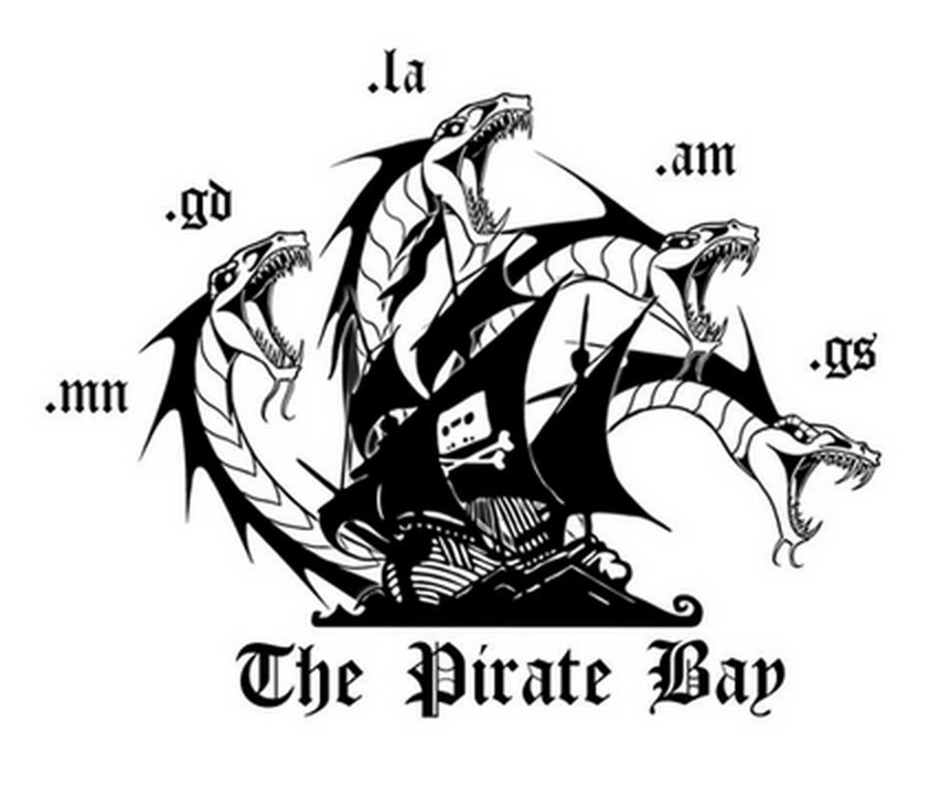
New Pirate Bay logo
This is pretty awesome, regardless of your opinion of TPB. If you see them as sort of punk rock establishment fighters, you're bound to love the visual middle finger. If you think they're villains, well at least they're suitably entertaining ones.

Hamburger update: totes fine
From UXmatters, "Why It’s Totally Okay to Use a Hamburger Icon."
The pendulum swings to a reasonable center. Which, apparently, is the part of a mobile screen where users focus. This makes sense, too.
Don't call it the hamburger to users, though.