Figma organization for busy designers
EDIT TO THIS POST: Figma has a much more native way of handling this now. It's pretty rad, try it out.
If you're like a lot of designers, especially young enthusiastic ones or possibly freelancers with time between projects, you love to organize and beautify your systems. I've made a new CSS theme for my markdown editor! I built a home page for my browser that beautifully links to my current projects and most common pages. Etc.
One of the big offenders in the mess of my work life is the list of Figma projects. It'll always be preferable to the classic joke of design_final_final_r2__final.sketch that anyone still in pre-Figma world is probably still dealing with, but it can be rough on the eyes.
I came up with something that works well for me.
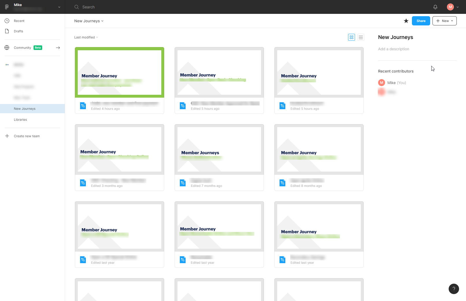
- Firstly, you have to give files a cover page. Just do it. Mine use a frame that is 1240px x 660px.
- Each Figma project is actually a project category: Online banking designs, public web page designs, internal software tools, customer journey maps, and libraries. Within those, each has its own style of cover page. This gives each listing page a unified feel and it's always obvious which list I'm looking at.
- I use the default gray background on the cover page, unless it's something I'm actively working on at the moment. Then I change it to green. This gives the cover a green border around it in the listing page.

Create components for those covers in case you feel like you might want to change them down the road. Et voila, you've really simply gone from a mess in your projects list to an organized and legible design portal.