
Good points here. I think we're actually pretty good at this. We tally Zendesk feedback and periodically meet with customer service to see what's actually a problem and what is just the result of a few loud voices.

Good points here. I think we're actually pretty good at this. We tally Zendesk feedback and periodically meet with customer service to see what's actually a problem and what is just the result of a few loud voices.
EDIT: I spent a lot of time using Jeet on a lot of sites and apps once I discovered it. Thanks, Jeet.
I've used a lot of CSS frameworks, minimal grids, etc etc. I've even made my own, which frankly would've worked for this site. But it didn't work for the more complex purpose I had hoped to apply it to, so I ended up using Jeet, which is a variation on what this site actually uses.
This site uses Lost Grid, a PostCSS based system that's pretty neat. But its creator's earlier work, Jeet (for Stylus or Sass), is a pretty beautiful creation on its own. Awesomely, it's now being maintained again by someone else, so it feels alive and pretty safe to use. That's nice because I'm just not quite ready to throw PostCSS-based tools into production yet. I need speed, and speed means familiarity. That means Sass. I'd encourage anyone looking for a grid that is only a grid to look at Jeet.
Pretty comprehensive writeup about the use of icons from the makers of iA Writer, one of the App Store's most popular overpriced minimalist writing apps.
The long and short of it:
So... everything is bad, more or less. They advise getting things right without icons in the IA and wireframing stage, then adding on the emotional component as part of UI design. Sound approach, but ultimately we're still left with icons as a pretty good solution that are still mostly unable to convey verbs and abstract concepts.
I love Spotify's Discover Weekly. It's incredibly outstanding. It's just about the best recommendation engine I've ever come across, save maybe Last.fm's. The mix of science and crowdsourcing behind it is fascinating; no wonder it works. It's even replaced Last.fm as my primary recommendation method, although to some degree that's because it's a push based system where I don't even have to try. It's always there for me.
Is there a downside to this? I don't really see one. In theory, people used to rely more on others to get their recommendations. This still uses your friends — and people you don't even know who share your current taste — to push recommendations to you. I actually liberally spam my friends with albums, too. I'd wager that if you were the type to do that before, you're still doing it, and if you weren't, you're getting more recommendations now.
There's a criticism that anything algorithmic is going to by its nature be "safer" and work within a set of boundaries, whereas randomly listening to college radio can break you out of your existing sonic box. I suppose that's valid, but I listen to such a wide variety of genres and popularity levels on Spotify that I don't really get that effect. Here's some stuff on the rock end of the spectrum I discovered using the playlist.
The Drink (dark twee folk-prog?)
(oembed: https://www.youtube.com/watch?v=EjMK6hMIFuo)
Milk Music (YouTube commenter gets it sorta right for once: "Sounds like the Wipers joined CCR and played Husker Du covers)
(oembed: https://www.youtube.com/watch?v=CPc5tHUn4ww)
Sheer Mag (whose record my friend Adam in Cleveland mastered)
(oembed: https://www.youtube.com/watch?v=Pr2um9KXkgQ)
Here's Jonathan Snook with what is probably a more measured response than mine.
I suppose it was only a matter of time. The backlash always appears. It's a pretty old argument to be honest, the idea of getting "back to basics" or "using the web as it was meant to be used." But the reason that front end devs have gotten a bit away from these kinds of methods of styling is that it doesn't support everything that everyone wants to do anymore.
I'd still say that if you're making a website — even if you're working with atomic or styleguide-driven design — you're better off taking advantage of HTML elements, ARIA roles, and the cascade to style your site. But in the world of applications where structure is arbitrary and markup is not necessarily the most readable thing in the world (and guess what, this is often out of our hands), being reusable and "bulletproof" is more important to a lot of front end folks.
It's funny because this debate appears just as I'm finally considering adopting BEM in a project. I love — and need— the idea of a self-contained piece of UI that I can drop anywhere. At its best, this is front-end methodology as UX improvement, because the consistency of those pieces of UI helps the overall experience. Even without that benefit, it aids in speed of dev. Embarrassingly, perhaps the main reason that I gravitated toward BEM is that I'm sick of figuring out what to call things as I place HTML elements on a page.
This is a potentially really nice solution to one of the worst things about responsive design. At work, our app is chock-full of tables and it's been one of the big reasons why we haven't gone responsive.
I spent a lot of time a couple months back experimenting with the new version of Reaktor. It doesn't actually work on my studio computer because it requires Yosemite, so it was something I could handle while at home on my newer Macbook Air (which runs Reaktor surprisingly well). For a cover and the title, I blasphemed the only Parvulus Infectus album released while we were together. It's maybe inspired by Bowie's cover for The Next Day.
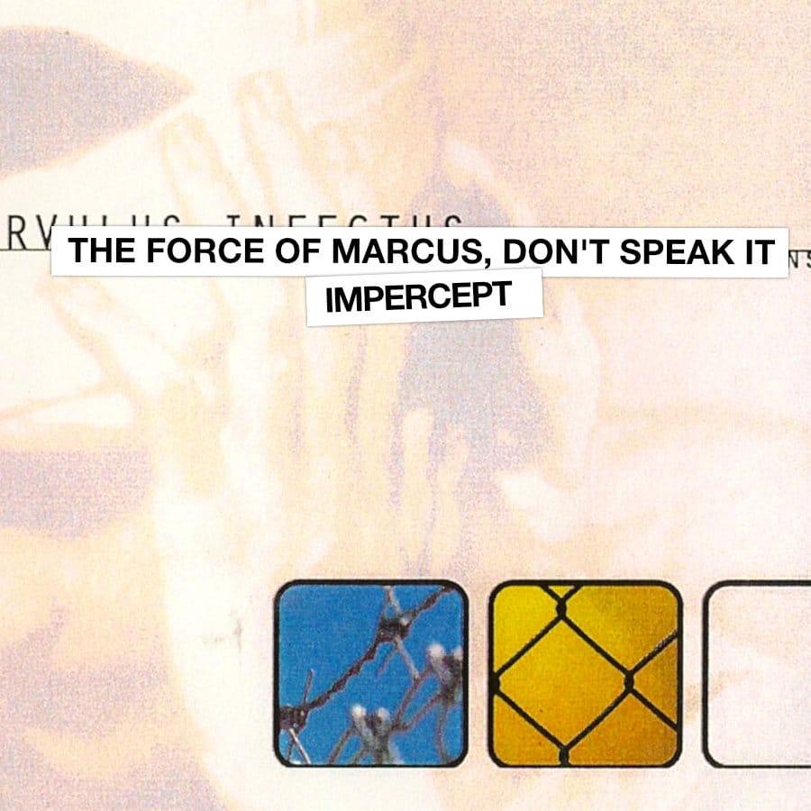
Have a listen, and maybe like Impercept on Facebook for more of my musical experiments that don't logically fit with one of my bands.
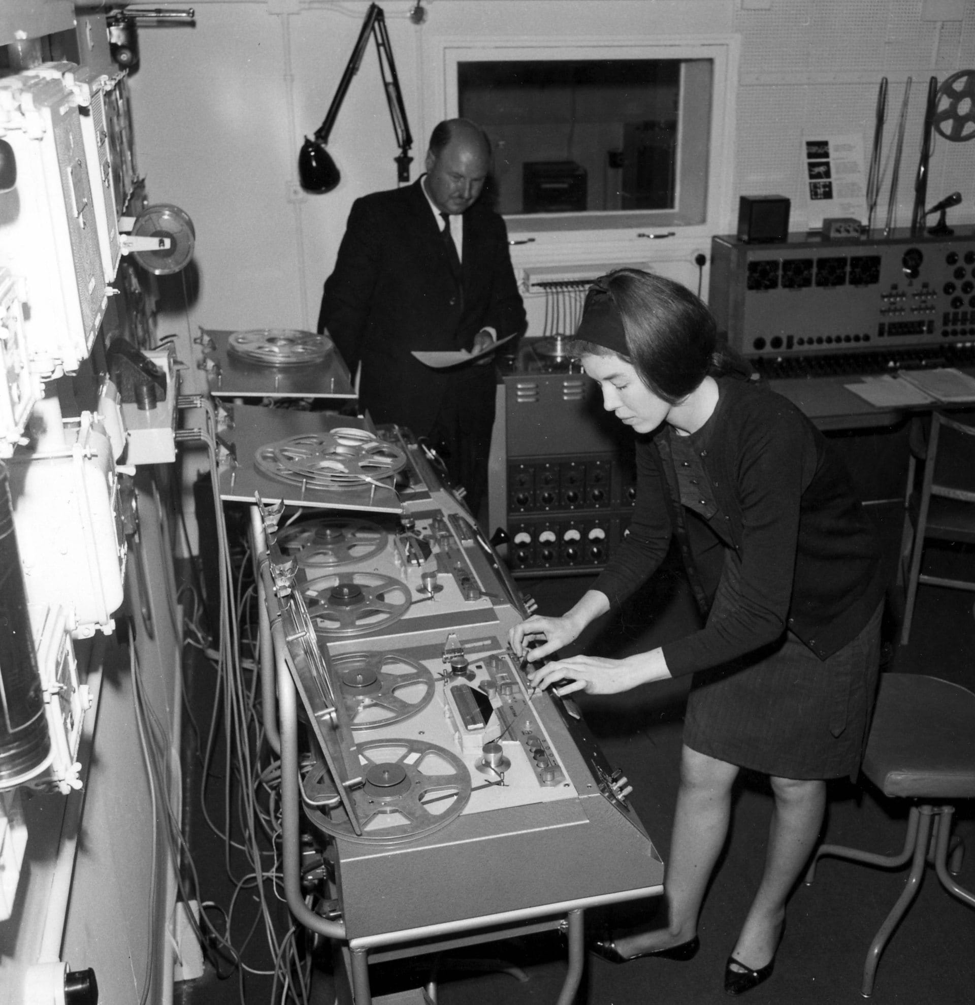
Really cool pictures, mostly from the 60s but some even earlier, of the place where the BBC employed practitioners of hard core experimental electronics to make commercial sound.
There's Delia Darbyshire, Daphne Oram, an EMS Synthi 100, and all kinds of tape loops hanging everywhere. So cool.
This looks very cool. I tend to get pretty excited about JG Ballard movies in general — they turn out better than most Philip K Dick adaptations — and High-Rise looks pretty promising. These designs look authentically of a particular time, but their generic nature reminds me of the products in Repo Man.