
This is a pretty good set of guidelines. I usually set up rules for any given project; I can't say that I've ever really had a major guiding principle for how I'm going to do things.

This is a pretty good set of guidelines. I usually set up rules for any given project; I can't say that I've ever really had a major guiding principle for how I'm going to do things.
Pretty comprehensive writeup about the use of icons from the makers of iA Writer, one of the App Store's most popular overpriced minimalist writing apps.
The long and short of it:
So... everything is bad, more or less. They advise getting things right without icons in the IA and wireframing stage, then adding on the emotional component as part of UI design. Sound approach, but ultimately we're still left with icons as a pretty good solution that are still mostly unable to convey verbs and abstract concepts.
I feel like this applies to desktop as well. The idea of not hiding options is appealing. I wonder where along the way we (collectively) stopped putting radios out there — it's probably in the interest of keeping UIs "clean" and concise. But concise is a function of the actual design of fields and we need to fight for easier controls and fewer options, not a visually appealing mess.
This is how you show you mean business on mobile-first.
Great stuff from Nicole Fenton. This is a talk but translates well to a writeup.
UI copy gets the shaft so often, not just in terms of the attention it receives but also the way it's written.
You write code iteratively, so why not the rest of it? It’s okay if your interface writing isn’t perfect. But you better believe that you need to go back and clean up those strings before you go live.
This is really important. Every project I've ever been a part of forgot the "we can improve later" mindset of Agile to some degree when faced with the prospect of launching with imperfect interface copy.
From UXmatters, "Why It’s Totally Okay to Use a Hamburger Icon."
The pendulum swings to a reasonable center. Which, apparently, is the part of a mobile screen where users focus. This makes sense, too.
Don't call it the hamburger to users, though.
You should do this.
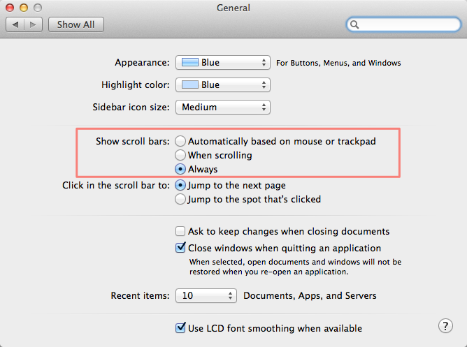
Obviously different OSes have different scrollbars, but you'll save yourself a lot of trouble and possibly spot some HTML mistakes before they get bad from just knowing they're there.