Bob Moog and usability heuristics
Here's a rare intersection of my interests. This is actually a great article for UX folks who don't know anything about synthesizers.
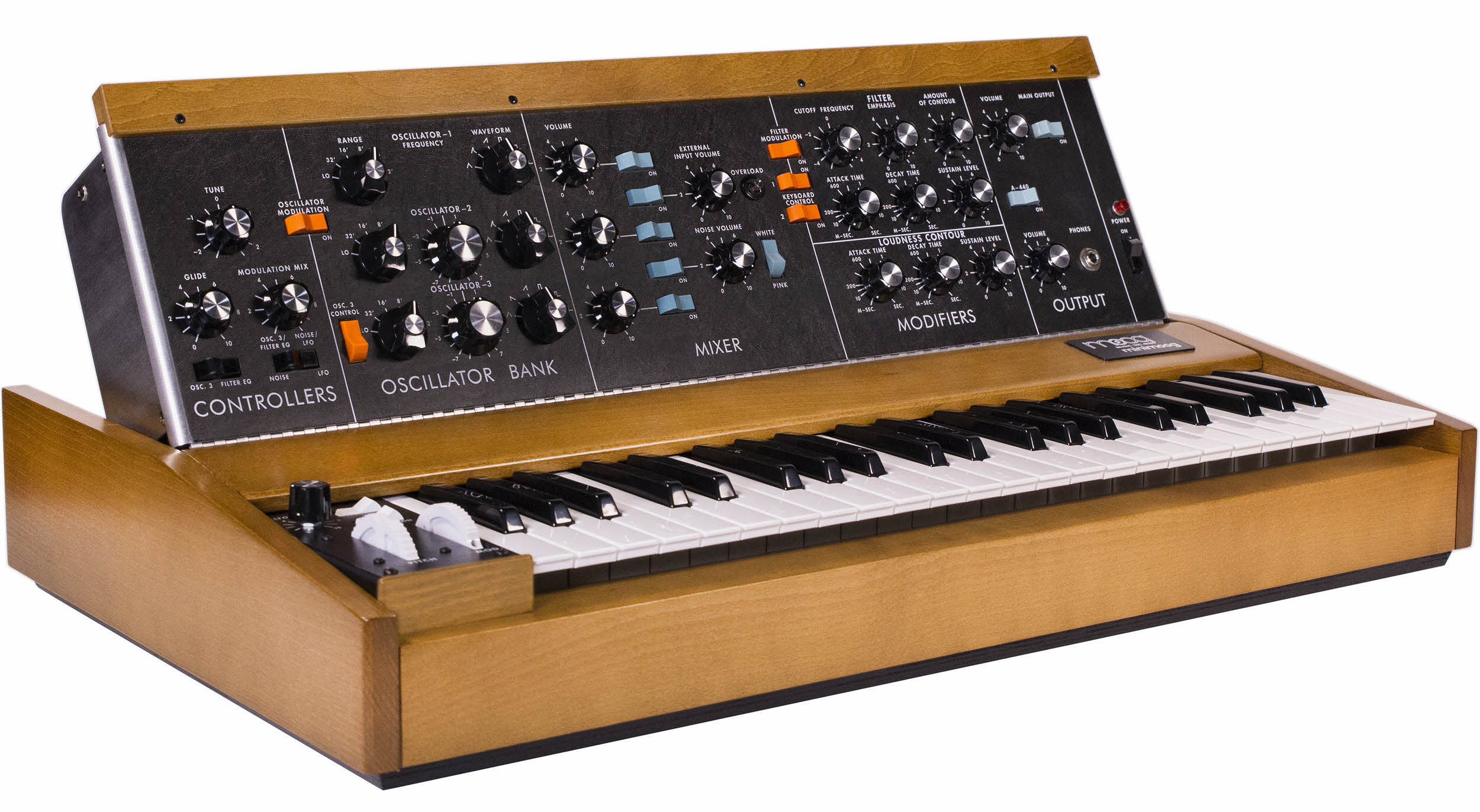
The author makes the (accurate) argument that Bob Moog changed the game by hard-wiring some signal paths and abandoning the fully customizable cable-based routing of modular synths.
This is essentially what Apple did in terms of UI as well that led to their early success:
- Preset the red routes.
- Enable other routes with some switches that are not part of the main UI.
- Just abandon the ability to do some things that most users won't need.
That made Apple popular with artists, designers and musicians, just as the Model D became the first synth truly popular with a wide range of musicians. Sure, the Rick Wakemans (and Linus Torvalds) of the world might want more, but they have their complicated alternatives. For the rest of us, it was finally time to make music with synths. Just watch any gear-focused interview with John Foxx, Gary Numan, George Clinton, Rick Wright, you name it — the Model D hugely influenced their worlds so they could influence the rest of the world.
This philosophy can still be controversial at times, as with GNOME 3 (which, incidentally, has become less loathed in the years since its release), but in general the idea of solving for the 90% of users who don't need 50% of the features is considered an obvious one nowadays.
Of course, modulars have seen a resurgence lately because once you're in deep you inevitably want to start making your own synths. But that hasn't stopped the steady stream of simplistic analog boxes like the Volca series or Behringer's slavish old-school synth imitations. Options are great, but menu diving is no fun and the quickest way to get a musician to love your instrument is to get them creating quickly.
And this, as the article gets across pretty well, is what we should learn from Moog.
Apple would've patented the pitch wheel though.